Maya Business Missions
Redesigning an underused rewards feature into a gamified experience for Maya Business merchants.
Project Duration: 5 Weeks
My role: Intern, User Experience Design Department
Tools used: Miro, Notion, Figma, Maze, Microsoft Suite
The Problem
When I joined Maya — one of the Philippines’ largest fintech companies — as a UX Design Intern, the company was rebranding from PayMaya to Maya and rebuilding its entire design system.
I was assigned to the Maya Business team for my first project, tasked with improving engagement among merchants. Despite offering valuable services like bill pay, referrals, and top-ups, most users only used the app for basic transactions. Maya had an existing “Missions” feature meant to drive exploration, but it wasn’t working.
It is worth noting that accessibility was especially important for this solution. Maya’s users weren’t just tech-savvy business owners—they also included micro-business owners: sari-sari stores, tindahans. Designing with the average Filipino’s tech literacy in mind wasn’t just thoughtful—it was essential. After all, Maya’s mission was to empower and serve businesses of all sizes.

Screenshots of the existing Missions feature.
Through audits and usability testing, I uncovered 3 core problems:
1. Low Awareness & Visibility
Most users didn’t even know Missions existed. The feature was buried in the interface, and rewards weren’t surfaced contextually—there was nothing nudging users to explore or letting them know value was waiting.
2. Unclear Value
Every mission had the same vague CTA: “Learn More.” Meanwhile, reward tags read like a mystery box: “Cashback,” “Cash-in,” “SM-eSukli Multiplier.” For merchants who already spend minimal time in the app, this meant one thing: confusion.
3. Poor Feedback & Flow
While Maya’s mission flow original experience was stretched across 26+ disjointed screens, with no real sense of direction or progress. Users completed tasks without knowing it—and worse, without feeling anything. No feedback. No confirmation. No moment of reward.
(Bonus) The UI was outdated.
While I already mentioned that Maya was rebranding, it absolve the fact that every mission looked identical. No hierarchy. No visual cues. Just a flat list of cards with the same weight and tone (even thumbnail!)
The Approach
1. Audit & Discovery
To get a good grasp of the current state, what we’re doing wrong, right (more importantly wrong) Maya’s flow had a whopping 26 screens.
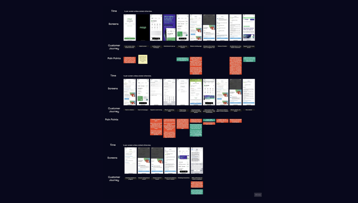
Design & experience audit of existing Misison’s flow.
Then it was time to look outwards, I conducted a competitive analysis of GCash, GrabPay, and Coins PH
Identified common reward patterns, emotional hooks, and UX gaps.
Created customer journey maps and synthesized.
*Upon request, I can share my full Competitive Analysis deck if you’d like a deeper look at my research process.
2. Reimagine, reorganize, then redesign.
The solution had to go above redesign. I conducted an ideation session with my teammates: my Mentor and a fellow UX intern.
From the ideation, we came up with a lot of ideas, some good, some great, (some not so great), and together decided on which ones were worth designing then I proceeded to create my low-fidelity designs based on the MVP user flow.

Screenshot of concepts from ideation session and design considerations
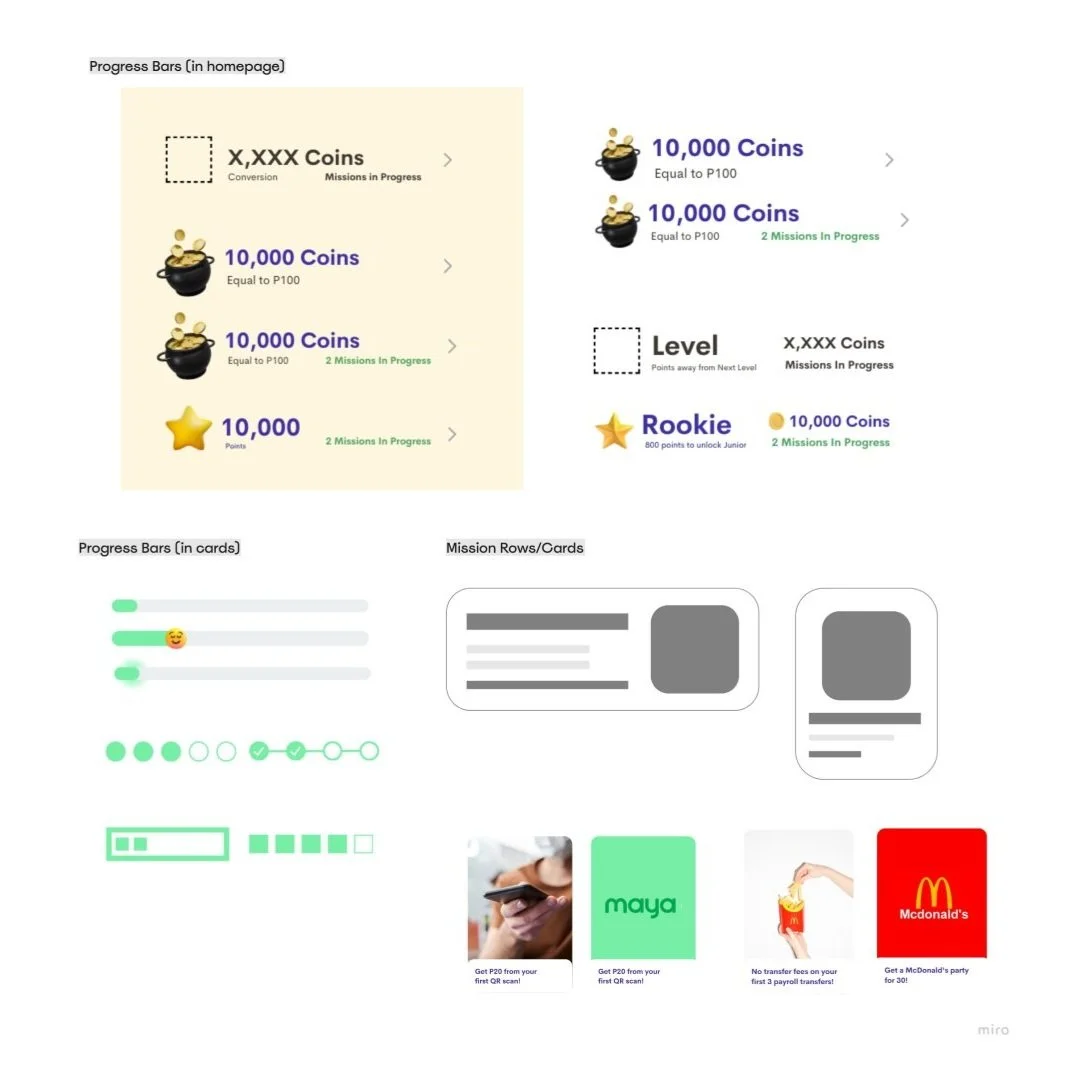
Experimenting with different gamification design elements

Approved MVP user flow before moving onto wireframes.

Medium fidelity wireframes for Round 1 of usability testing.
3. Usability Testing & Iteration
I ran 2 rounds of testing (5 participants each) using Maze through both remote and in-person sessions.
Round 1 was with my medium fidelity wireframes and it was humbling.
"“What if the mission isn’t linear”Saved and share didn’t make sense”
“Simplify missions dashboard. Reduce clutter’
“How do expired/expiring missions look like?”

^That’s the beauty of collaboration, I was thrown with so many questions I haven’t considered.
Key findings of Round 1:
25% success rate
14.5% misclick rate
361.7s average task time
So I iterated. And Round 2 went better (hooray!)
The Results

How design directly solved the problems we uncovered:
Low Awareness & Visibility → Strategic placement on the home dashboard and mission entry points triggered by user actions
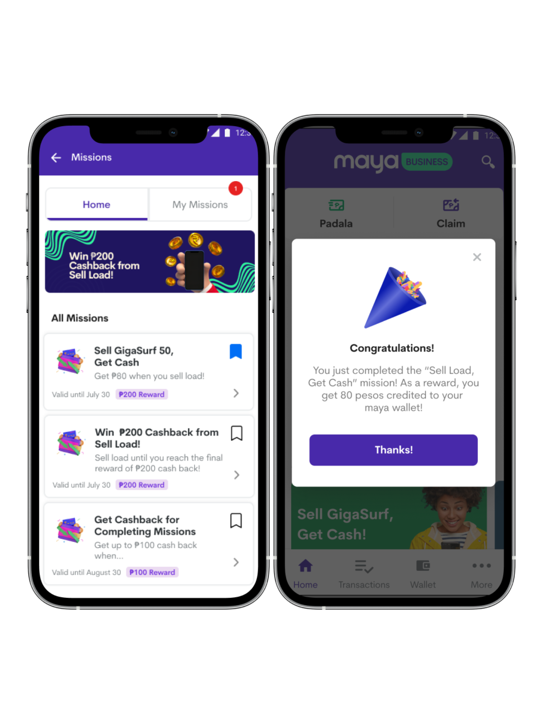
Unclear Value → Simplified language and reward labels like “₱200 Reward” to remove ambiguity
Poor Feedback & Flow → Clear progress states, visual confirmation moments, and reward animations that reinforced success
The redesigned Missions feature turned a static, overlooked tool into a behavior-driven, rewarding experience.
Key findings of Round 2:
40% reduction in flow duration
Misclick rate dropped from 14.5% → under 5%
Task success rate rose from 25% → 80%
The final designs were presented to C-suite leadership; received approval from the Head of User Experience Design and delivered a high-fidelity prototype + handover document to support the next phase of development and planning.
